Getting Started with DeskDirector
DeskDirector Portals
Browser Support
What is the DeskDirector Admin Portal?
What is the DeskDirector TECH Portal?
What is the DeskDirector Client Portal?
Desktop Portal
Managing Your Account
Pricing & Subscription Plans
Deskdirector - Sign up walk through
Managing your DeskDirector Subscription
Admin Essentials
Release Notes
Permissions & Feature Configuration (ConnectWise/Autotask Partners)
Automatic Contact Creation
The Developer Corner
DeskDirector Features Overview
Desktop Portal Version Differences
Logging in to DeskDirector
Managing Tickets with DeskDirector
User Profiles & Profile Pictures
Office Hours
How Searching Works
Embedding Help Page Media
Get started with the DeskDirector Power Automate Connector
Features
Portal Customization
Service Catalogue
Forms
Communication
Actionable Messages for Emails
Real-Time Chats
Notifications
Email Notifications
Email Template Engine
Surveys
Broadcasts
Generative AI
DeskDirector with Generative AI
Setting up AI Service Providers
AI Assistants in DeskDirector
Custom Tools for AI Assistants
Knowledge Bases for AI Assistants
Ticket Summary for TECH Portal
Set up Microsoft Foundry Agent Service with DeskDirector Portals
Advanced
Login & Authentication
Accounts and Companies
Contacts
Contact Groups
Approvals
Task Lists
The Learning Center
Tags
Custom Domains
File Storage
Portal Deep Linking
Service Dashboard
Auditing and Analytics
Integrations
ConnectWise
ConnectWise Custom Menu Item for DeskDirector Tech Portal
ConnectWise
ConnectWise Quotes & Invoices
ConnectBooster
ConnectWise - Avoid Aggressive Notifications
AutoTask
Switching or Merging PSAs
QuoteWerks
Wise-Pay
TimeZest
BiggerBrains
OneNote Notebooks
Integrations - Frequently Asked Questions
IT Glue
Microsoft Teams App
Introducing the DeskDirector for Microsoft Team App
Installing the Microsoft Teams App (Client Mode)
Installing the Microsoft Teams App (TECH Mode)
Setting up Tags for Teams Discussions (TECH Portal)
Branding the DeskDirector Teams App
DeskDirector Teams App Notifications
User Groups Integration with Microsoft Teams
Setting up Content Security Policy (CSP)
Advanced topic: Setting up Tech & Client Mode in the same tenancy
Integrating Microsoft Teams with DeskDirector Tech Portal
Smart Alerts for TECH Users
Microsoft Power Automate
Actions
Solutions
Power Automate Template Gallery
Featured Solution: Teams Ticket Discussion
Featured Solution: Ticket Briefing
Power Automate Administration
Power Automate Connector - Setting up your first flow
DeskDirector Power Platform Connector Reference
Troubleshooting
Troubleshooting via Web Developer Tools
Desktop Portal - Common Issues
Contact & Service Agent Impersonation
Diagnose Entities Tool
DeskDirector Desktop App - Installation Issues
Troubleshooting DeskDirector Connection Issues
Login & Authentication - Common Issues
Permissions & Access - Common Issues
Tickets & Chats - Common Issues
Approvals - Common Issues
Email & Email Delivery - Common Issues
PSA Entity Syncing - Common Issues
PSA Integration - Common Issues
ConnectWise Integration - Common Issues
Autotask Integration - Common Issues
ConnectWise Audit Trail - Exporting API Logs
Microsoft Teams App - Common Issues
Contact DeskDirector Support
Security
Glossary
Archived
- All Categories
- Archived
- Color Theming a Portal via Brand Packages
Color Theming a Portal via Brand Packages

Customization of the portal's color can be easily defined from the theming section of a brand package. There are two options to defined colors in a brand package -- Portal Theme and Advanced Theme
This guide will explain how and where each color assignment affects in the DeskDirector Portal.
Portal Theme
The easiest way to set colors for the portal is via the "Portal Theme" section of a brand package.
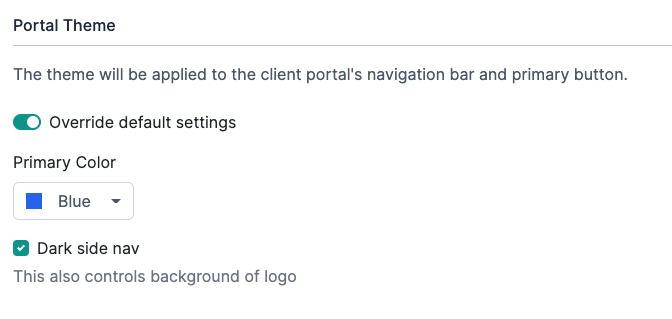
Just select a primary color from the list, and we will define every other element's color based on the primary color you selected. This means you do not have control over the colors of the elements on the portal aside from selecting the primary color for the palette.
Dark side navigation converts the login screen and the left navigation into dark gray when enabled. If disabled, the login screen background and the left side navigation will turn white.
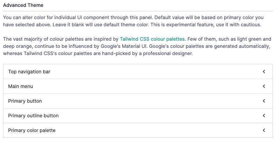
Advanced Theme
If you want more control over the colors what will be used in the client portal, you can use the Advanced Theme section of a brand package. This allows you to control several individual elements in the client portal.
Color Palette
At one point, the DeskDirector client portal used the Material color palette, but we have since switched to the Tailwindcss color palette. Only a few color variants do not have an equivalent in Tailwindcss, so we have been using the Material color palette.
The color such as light-green, deep-purple, deep-orange, they are still using Material color palette and also has been marked at deprecated. We will migrate them to closest variant in the future.
Color Variants
The naming of color variant was called as primary, accent, warn. We have now switched to call them as primary, secondary.
- Primary is the color displayed most frequently across the client application. We can also treat this as brand color.
- (Locked) Secondary is mainly for component that supposed to be subtle. The secondary color has now been locked to blue gray. Make it more generic and it fits to its meaning and it can be fit for majority of colors.
- (Removed) Warn is an problematic choice. It was bad decision our designer made at the time. It has no meaning. Is it warning or is it error color? Should it be red or yellow? Can we use rainbow on warn? If we use blue on warn, do people treat blue text as warning?
Primary Color Palette
You can change primary color palette in our brand setting. You can also define your own. By defining your own color palette in advanced setting, you can change any UI component that uses primary color.
Admin portal has tailwind color palette loaded, which you can type name and select them. You can also hire designer to design your own color palette.
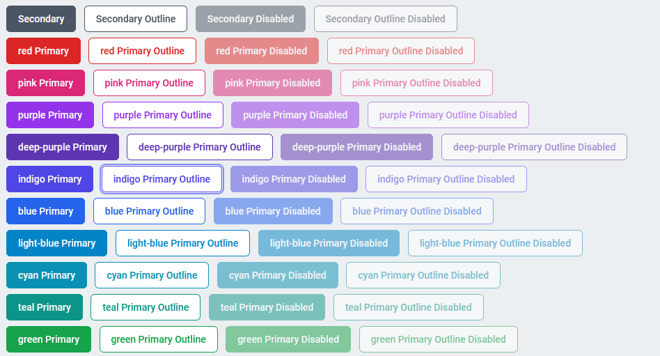
Button Variants
Our UI was start as Material UI and now have switched to more common style. Material UI has poor user experience. The button style we use is similar to Bootstrap.
You can check button under different color palette under link below. (Please change the host to your DeskDirector server host)
https://{your_server_domain}/portal/v2/themes/demo/buttons