Table of Contents
Custom Branding
 Updated
by Niamh Ferns
Updated
by Niamh Ferns
Custom Branding Overview
You can easily define branding for your DeskDirector portal from the Admin Portal. In this article, we will explain how to set them up and where they will be used.
Branding the Portal using Brand Packages
Brand packages enable you to deploy custom branding for specific companies or based on your custom domains.
Start creating your brand packages via the Admin Portal under System > Brand Packages:
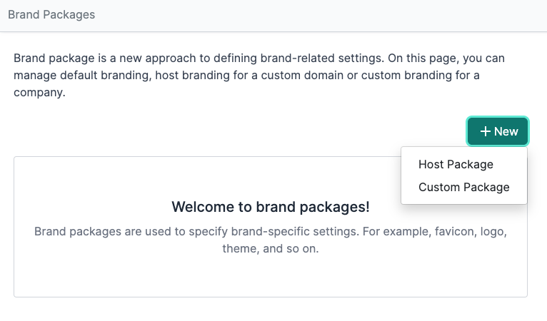
Host Package vs Custom Package
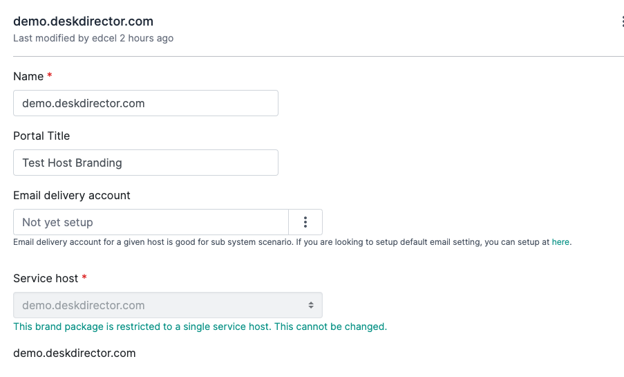
The main difference between host and custom packages is that a host package is deployed for a specific hostname/custom domain. This comes in handy if you have multiple custom domains you want to deploy specific branding for each. The service host can't be changed and is specifically assigned to the URL:
Custom packages, on the other hand, can use any host URL available and can be updated anytime.
Brand Packages Elements
Several elements can be specified/customised for every brand package you will create.
Portal Title
This is what your portal will be named.
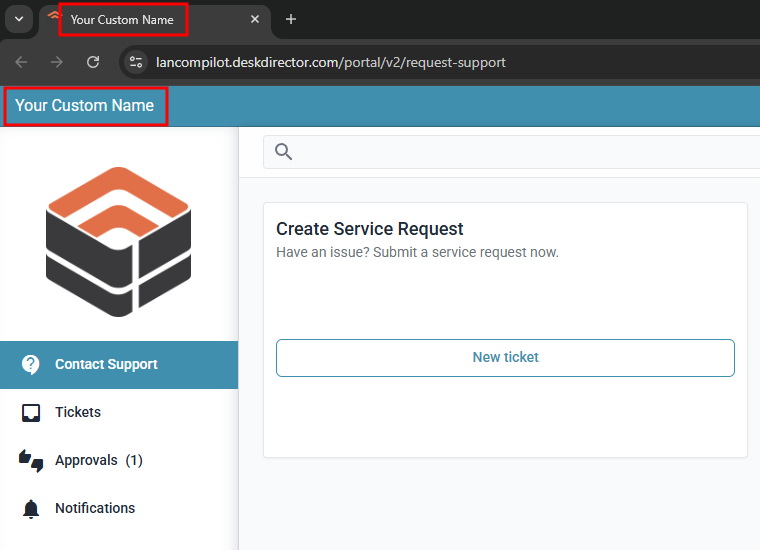
For example, if your company name is VeryAwesomeITPeople, you can use VeryAwesomeITPeople Support Portal as your portal title. You can use any title that you prefer. It will be displayed inside the portal, on a browser tab, and when the site is saved to someone's mobile home screen.
Email delivery account
The deployment of brand packages has also enabled us to deploy specific email delivery accounts based on your custom domain. This way, a specific mailbox can be used for email notifications for certain hosts/companies.
With this setup, you can have an email delivery account from support@companyA.com and be assigned to Company A, then another email delivery account for other hosts/companies.
Service Host
Your DeskDirector URL and any custom domains added to the instance. This value is used inside email templates that reference the DeskDirector URL token.
Colour Themes
This is controlled by the Portal Theme and Advanced Theme section. Here you can specify the global colour scheme for the portal.
Logo Images
Favicon
A favicon is typically used in a web browser's tab. It is used to help indicate which website the tab belongs to. Here is a screenshot of both the Portal Title and the Favicon defined, and how it will look on a browser tab.
Logo
A logo is used in the portal's login screen and in the left side menu after logging in. It is recommended to use a PNG with a transparent background as this can easily adjust to whatever colours are used when theming your DD Portal.
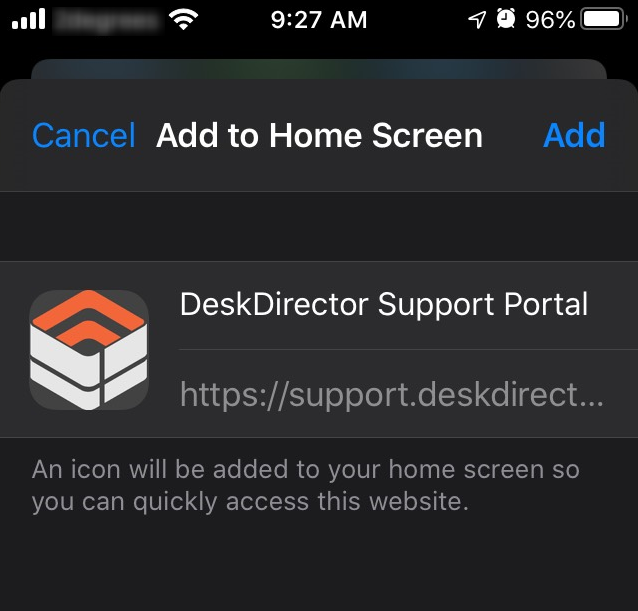
Mobile Logo
The mobile logo will be used when the web portal is added to a smartphone's home screen.
Colour Theming
The easiest way to set colours for the portal is via the "Portal Theme" section of a brand package.
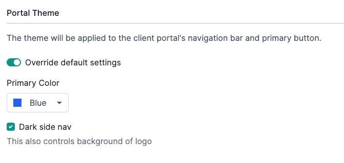
Just select a primary colour from the list, and we will define every other element's colour based on the primary colour you selected. This means you do not have control over the colours of the elements on the portal aside from selecting the primary colour for the palette.
Dark side navigation converts the login screen and the left navigation into dark grey when enabled. If disabled, the login screen background and the left side navigation will turn white.
Advanced Colour Theming
If you want more control over the colours that will be used in the Client Portal, you can use the Advanced Theme section of a brand package. This allows you to control several individual elements in the client portal.
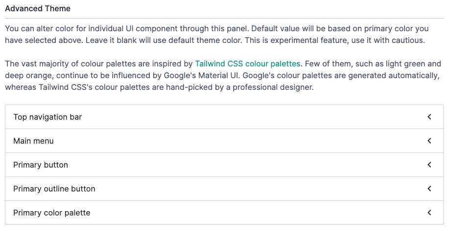
Color Palette
At one point, the DeskDirector Client Portal used the Material colour palette, but we have since switched to using TailwindCSS. Only a few colour variants do not have an equivalent in TailwindCSS. Colours like light-green, deep-purple, and deep-orange are still using the Material colour palette and have also been marked as deprecated. We will migrate them to the closest variant in the future.
Color Variants
The naming of colour variants previously was primary, accent, and warn. We have now switched to calling them primary and secondary.
Primaryis displayed most frequently across the client application. We can also treat this as the brand's colour.Secondaryis mainly for subtle components. The secondary colour has now been locked to blue-grey as this fits the majority of use-cases.Warnused to be available, but we found it to be a problematic choice, and so it was removed.
Primary Colour Palette
You can change the primary colour palette in our brand settings. You can also define your own. By defining your own colour palette in the advanced settings, you can change any UI component that uses the primary colour.
The Admin Portal has the Tailwind colour palette loaded, where you can type a name and select the one you want.
Hosts Configuration
There are instances where you are using a custom domain for your DeskDirector instance, or you are using Streamline IT, and you want a specific host, icon, logo and title will be displayed differently from your main instance.
This can be easily done in the Admin Portal under System > Hosts Configuration. This configuration page is designed for DeskDirector instances with multiple DNS records, such as custom domains or multiple subdomains.
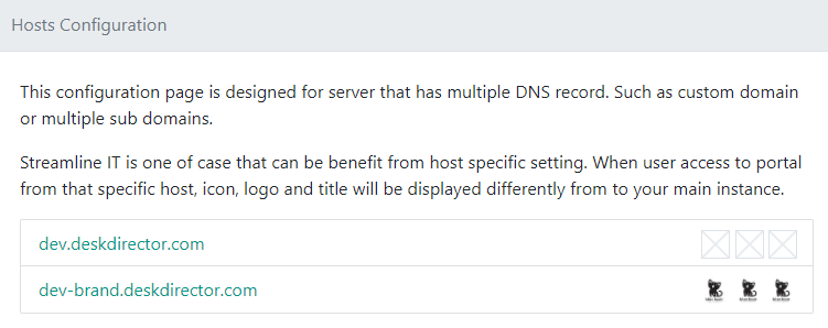
The screenshot above shows our dev instance with a custom subdomain. The 3 boxes adjacent to each subdomain represent the favicon, logo and mobile logo set for each URL. You can configure the colours and images for each URL by clicking on each, and it will reveal a page where you can specify the portal title, colours, and logos.
The fields themselves should be roughly the same as those in the global settings. Any changes here override the global setting.
Applying a Branding Package
To apply a branding package to a company, make sure you have configured the package as a custom package and then:
- Navigate to
Client Portal>Accountsin your Admin Portal, and then select the account you want to apply the package to - Under Branding, select the hamburger menu icon and search for the package you want to apply by clicking Override brand package
- Select the branding package you want and then click Select